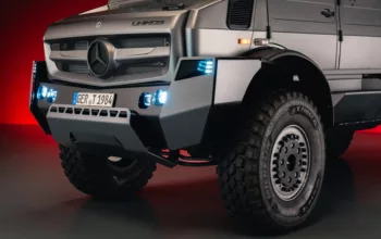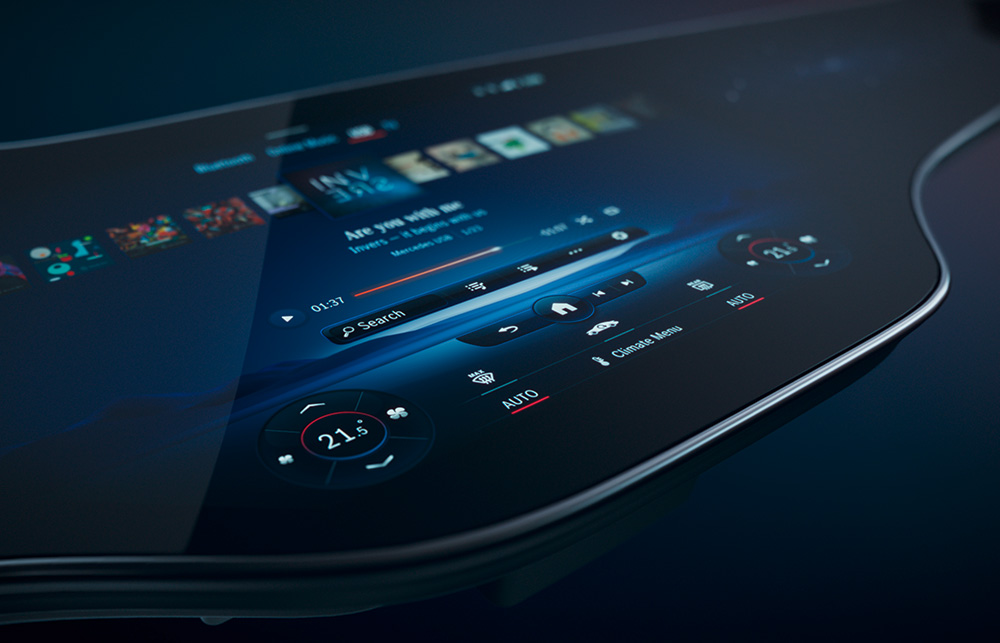
There’s a particular moment when stepping into a modern Mercedes-Benz can feel like entering a new kind of weather system—light, glass, and software all conspiring to reshape attention. The dashboard does not merely display information. It performs a choreography of surfaces, reflections, and responsiveness. At the center of that performance is the Mercedes-Benz Hyperscreen: a sweeping display that stretches across the cabin like a horizon line, inviting you to look up, look forward, and—almost against your will—linger.
Many people first approach it with a simple suspicion: “Is it just a big screen?” It’s a reasonable question. After all, the automotive world is full of glossy promises and sterile demonstrations. Yet a real user-experience test reveals something more nuanced. The Hyperscreen isn’t fascinated by novelty alone. It’s fascinated by perception itself—how your eyes track, how your hands seek confirmation, and how your expectations quietly update second by second.
First Impressions: When the Cabin Feels Like a Single Interface
The first contact is visual, but the first impression is tactile in spirit. The Hyperscreen’s expansive span changes the geometry of the driver’s world. Instead of juggling multiple islands of information, you encounter a continuous digital plane. Even without touching anything, you can sense that the cabin is tuned for coherence.
Common observation: the screen looks spectacular in photos, but in person it can feel like a display masquerading as design. On a Hyperscreen, that suspicion doesn’t always vanish—but it evolves. The longer you sit, the more the screen stops behaving like an object and starts behaving like a system. Layouts feel intentional. Areas of information appear where your attention naturally lands. That’s not luck; it’s ergonomics, but executed through software.

Boot-Up and Responsiveness: The Subtle Art of Not Feeling “Laggy”
Any modern interface can display menus. The Hyperscreen’s trick is the timing. On ignition, the transition from dark cabin to animated clarity is smoother than many expectations. Short animations, confident rendering, and disciplined feedback form a kind of behavioral promise: this system knows what you need before you finish deciding.
In a user-experience test, responsiveness is more than speed. It’s predictability. You learn quickly whether your touch will be acknowledged, where the UI will react, and how quickly it will return to composure. The Hyperscreen’s interaction design reduces the micro-moment of uncertainty that typically makes drivers glance away or fumble for physical controls.
That’s where deeper fascination begins. The display doesn’t only answer commands; it calibrates your confidence. It becomes a quiet co-driver for attention.
Touch, Gesture, and Driver Rhythm: Interface as a Behavioral Metronome
The driver’s relationship to the interface is rarely linear. You may press once, hesitate, then refine your selection. You may switch between navigation and media without making a big statement. A good system respects this rhythm.
On the Hyperscreen, touch interactions feel less like “operating a device” and more like shaping the cabin’s mood. Controls are visually anchored, and feedback is delivered in a way that reads clearly through peripheral vision. Even short taps have meaning. Gestures can feel like punctuation—quick, deliberate, and not disruptive.
Common observation: touchscreens in cars can be tiring, demanding, even distracting. The Hyperscreen mitigates that by pairing the expansive display with thoughtful UI behavior—grouping information, limiting clutter, and using spatial logic. Instead of presenting everything at once, it tends to reveal what you need, when you need it.
Deeper reasons for fascination appear here: the UI reduces cognitive friction. Your brain spends less energy deciphering the interface and more energy driving the conversation between road and vehicle.
Navigation and Media: From “Screens” to Contextual Storytelling
Navigation is where a large interface can either become an overconfident billboard or a genuine assistant. In real use, the Hyperscreen leans toward the assistant side. Turn-by-turn prompts feel integrated rather than imposed. Routes become legible. Decisions feel assisted rather than demanded.
Media selection also evolves. Music controls and playback views do not behave like remote buttons projected onto glass; they behave like a tailored channel. Artwork, information density, and control placement are arranged so your eyes don’t need to sprint across the display.
Short sentences matter here: the interface stays comprehensible. It does not drown you in options. Long sentences matter too: the system manages context, so the cabin keeps the same “voice” even as you switch topics.
The Hyperscreen’s Personality: Atmosphere, Themes, and Visual Comfort
A display is not just function. It is atmosphere. The Hyperscreen has a visual temperament that can shift with usage. Brightness management, contrast handling, and the way the UI occupies negative space all contribute to comfort over time.
In an experience test, the most telling moment occurs after the initial excitement fades. You begin to notice whether the interface causes fatigue. The Hyperscreen aims to avoid that by keeping UI styling consistent and by choosing typography and spacing that remain readable across varied lighting conditions.
Fascination deepens when you realize how rarely the screen demands attention. It frames information with restraint. It feels almost courteous.
Passenger Perception: Shared Space, Shared Attention
Cars are social spaces, even when the driver carries the responsibility. A wide display affects passengers in ways that can be surprisingly influential. In practical use, passengers naturally look up at the Hyperscreen—not just to admire it, but to orient themselves with what’s happening.
This changes the cabin dynamic. Navigation can become a shared narrative. Media can become a joint soundtrack. Even when the passenger isn’t directly controlling anything, the interface creates a common point of reference.
That shared attentional anchor is a subtle design victory. It reduces the conversational drift that happens when everyone is staring at separate screens or separate reflections.
Audio-Visual Integration: When Sound and Screen Behave as One
The Hyperscreen doesn’t exist in silence. It is part of a broader sensory system: audio output, voice interaction, and visual cues all interlock. In a user-experience test, the most satisfying moments are the ones where transitions feel seamless—where sound prompts align with visual states and the system acknowledges input without theatrics.
There’s a deeper reason this feels compelling. When audio and visuals coordinate, the brain receives fewer “interpretation tasks.” The vehicle becomes an environment with coherent rules, not a collection of competing subsystems.

Real-World Questions: Learning Curve, Edge Cases, and Confidence
No interface is flawless. A comprehensive user experience test includes discomfort points. Where does the system surprise you? What happens when visibility changes? How does it behave in fast transitions—switching from map to settings, from calls to media, from driving mode explanations to weather cards?
The Hyperscreen’s learning curve is not steep in the usual sense. Instead, it’s adaptive. You learn through use, and the interface generally rewards that learning with consistent patterns. When edge cases appear, the system’s logic still tries to preserve predictability, which matters more than pure speed.
Confidence becomes the measure. Drivers don’t just want information. They want certainty that information can be accessed without breaking flow.
Why It’s More Than a Display: The Fascination Behind the Glass
So, is the Hyperscreen “just a big screen”? It can look like one at first glance. But the actual experience reveals a deeper motive: the display is designed as a perception engine. It choreographs attention. It compresses decision-making. It turns the cabin into a responsive interface that feels less like a gadget and more like a new kind of instrument panel.
That’s the fascination that lingers after the test ride. It’s not only the size. It’s the way the system makes the driver feel supported without feeling managed. It’s the sense that the vehicle can hold context—then present it with restraint.
Outro: The Horizon Effect of Hyperscreen Living
When you finally step out, you might miss the Hyperscreen before you can articulate why. The answer often arrives in fragments: the coherence of information, the confidence of responsiveness, the atmospheric comfort, and the shared cabin storytelling. In practice, the Hyperscreen doesn’t simply show what a car can do.
It changes how a car can feel—less mechanical, more conversational. And in that shift, the obsession is easy to understand. The dashboard becomes a horizon. You look forward. The interface follows.